
Designing Events with Clarity, Calm, and Intention

As clockwork, every January, I sit down and discuss the Pantone Colour of the Year and how you can apply it to your event. But first, before we do that, it is imperative to understand the decision behind it. Is it just a shade of white? Or does it tell a larger story than it appears to? Let’s dissect it together.
Why Colour Choices Matter More Than Ever in Events
Colour has the power to influence us far more than we often realize. It stirs emotions beneath the surface, shaping our mood and behaviour long before we consciously recognize its impact.
Imagine this: after a long, demanding day at work, you come home and are faced with two living room environments. One features an industrial design with fluorescent lighting that casts a cool blue tone. The other offers a cozy, cabin-in-the-woods atmosphere, layered with soft lighting and warm hues. Which space feels more inviting—more conducive to relaxing and unwinding after a long day? For most, the answer is the latter.
Warm tones subconsciously evoke the sun, comfort, and familiarity. They create a sense of ease and belonging. While the industrial option may be sleek and modern, it is not typically perceived as a welcoming or emotionally safe space to fully decompress.
Of course, design preferences are subjective, and personal taste will always vary. Everyone is entitled to their own perspective. Yet the psychological impact of colour and light is well documented, and the evidence consistently supports how profoundly these elements influence our sense of comfort and well-being.
This principle applies just as powerfully to events, where colour plays a critical role in shaping emotion, focus, and perception the moment guests enter the venue. While high energy and engagement are often the goal, it is equally important to understand how to avoid overstimulation—long before attendees even arrive.
A colour palette should never be accidental. It must be a strategic choice, one that aligns seamlessly with your brand, your objectives, and the overall vision of the event. Which brings us to the question: how does PANTONE 11-4201 Cloud Dancer fit into that strategy?
What Is the Pantone Colour of the Year?
At first glance, it may appear to be a simple, natural shade—and in many ways, it is. Yet the Pantone team does not designate a Colour of the Year without intention. According to their research, PANTONE 11-4201 Cloud Dancer best reflects a current cultural and behavioural shift, capturing a collective emotional instinct that defines our moment. This is where it becomes truly compelling.
We are living in a period marked by overload—constant motion, relentless noise, and perpetual stimulation. More than ever, people are seeking quiet moments and uncomplicated ways to engage without feeling overwhelmed. Our streets are busy, our phones are ever-present, and true “third spaces” for pause and reflection are increasingly rare.
Perhaps this soft, understated shade of white is exactly what we need right now. Cloud Dancer reflects a shared desire to slow down, reset, and re-centre. It invites presence. It creates room for calm, clarity, and genuine human connection—elements that feel increasingly essential in today’s world.

This is precisely the outcome we strive for when designing an event.
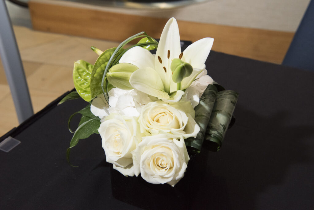
Upon closer examination, Cloud Dancer is described as an airy, billowing white that radiates softness, warmth, and quiet restraint—distinctly different from a stark, paper-white tone. Its subtle adaptability allows it to respond beautifully to light, materials, and surrounding environments, making it a powerful tool for customizing a venue and shaping the overall guest experience.
White Is One of the Most Complex Colours
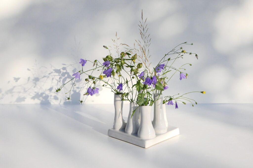
Fun fact—it’s true. Have you ever seen a wedding dress that was just a shade off? White is far more nuanced than it appears. It carries subtle undertones, ranging from cool to warm—blues, yellows, pinks, even greens—all of which shift and evolve depending on their surroundings.
It can be mind-boggling.
Even the smallest adjustments in saturation or brightness can dramatically influence mood and perception. When handled thoughtfully, however, white becomes an incredibly powerful design tool—one with remarkable potential when done right.
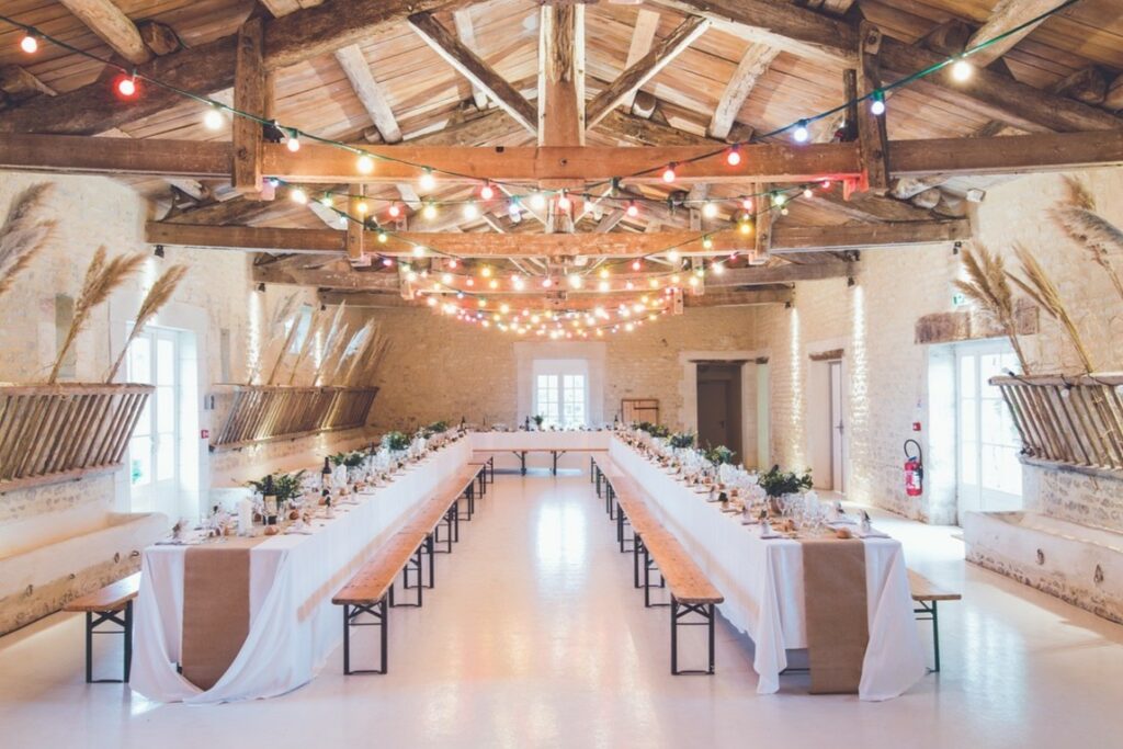
How to Utilize Cloud Dancer in Event Spaces
The most effective approach is to use Cloud Dancer as a foundational palette and build upon it. Because it does not demand immediate attention, it is ideal for creating a cohesive event environment—one that softens sharper design elements without overwhelming the eye. This subtle restraint allows other colours, particularly your brand palette, to take their rightful place and stand out with intention.
Cloud Dancer is especially impactful when incorporated through fabrics, draping, and spatial elements, where it enhances a sense of openness and lightness throughout the venue. Fittingly, the “cloud” in its name reflects its ability to create an airy, elevated atmosphere—effortless, calming, and adaptable.
How Can This Affect the Attendees
Having low visual noise from the beginning means lower sensory input, resulting in guests slowing down to observe and be present. To engage with one another, start conversations, and focus on the real objectives of the event.
Suggestion: Ideal for longer-format events where comfort matters!
Emphasize it in the following:
- As guests arrive, the reception zone, often referred to as the quiet before the storm, builds excitement.
- Use it as the “Go Away Green,” as Disney does, to redirect visitors from restricted areas or hidden elements.
- Use it as a base colour to complement your brand colours.
- Use it as a transition colour when building a story way.
- Or have an all-Cloud Dancer themed event, almost as stepping into a heavenly, forbidden event.
Key Takeaways for Event Professionals
There is no obligation to use this colour. Rather, it serves as inspiration—an invitation to be more deliberate in how colour is applied. When incorporated thoughtfully, PANTONE 11-4201 Cloud Dancer can be leveraged to enhance emotional impact and help shape an event designed with true intention.
In a world filled with constant noise and stimulation, creating space becomes one of the most powerful design choices you can make. If you’re interested in curated palette combinations or strategic guidance, feel free to reach out to me for event advice.