In our day, we need to understand that there is a huge shift in how consumers think. They do not make purely rational decisions anymore. As a matter of fact, they take their time and pay attention to how something affects them. “Does this bring me joy?” is asked more than ever now.
Why this matters for event design
By learning and diving deeper into the psychology of color, its effect on attendees, and how to use it to our advantage, we can offer much more than products or services, but an experience that radiates value while reinforcing brand identity in event design.
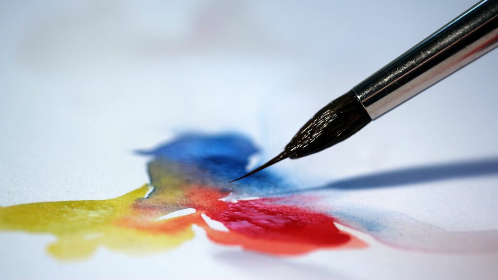
Since childhood, we have all interacted with color, had, or still have, a favorite shade, whether we want to admit that or not. Therefore, this makes you question why we subconsciously gravitate towards a certain hue. What is it exactly about that tint that holds such importance in our ordinary lives? Or is it simply a bunch of mixed primary colors with no meaning at all? All of this leads to what happens in our minds when we see a shade.
The Art of Perception in Event Design
The keyword is stimulation. People naturally respond to visual cues, and color is often the first impression your event makes. A thoughtfully curated palette should evoke emotion, spark interest, and create a sense of connection. Much like the feeling you experience when seeing a loved one, the right colors can inspire comfort, excitement, and positivity. These emotional responses become part of the guest experience, helping to create meaningful moments and lasting memories. And ultimately, isn’t that exactly what every great event is designed to do?
Trigger Their Emotions
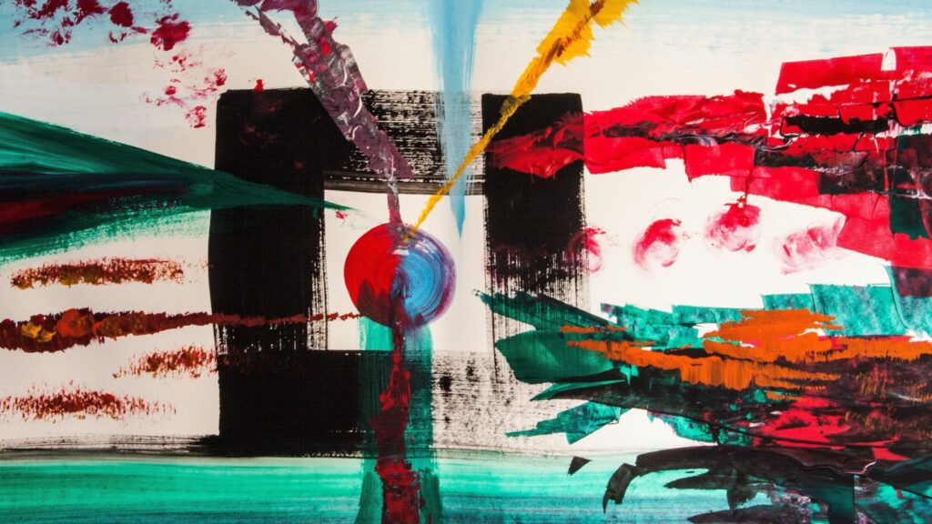
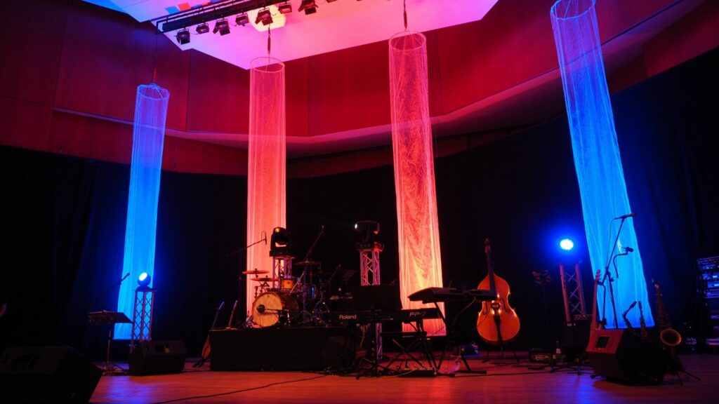
We all know that the emotional effect is powerful at an event. We can use the venue environment to create a narrative, from high to low impact, with a meticulously handpicked palette that plays on guests’ hearts. It is not sorcery, it is science, believe it or not. You can achieve a lot by shifting, dimming, or highlighting with lights, tones, and accents. This can be applied to anything, from food to décor setups, all of which participate in the immersive aesthetic we are trying to express.
Set the Mood by Using
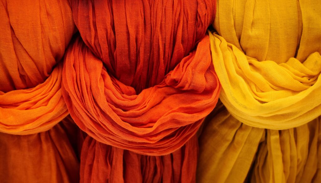
- Red: energy, urgency, excitement are exactly what is needed for hot upcoming launches or a nightlife vibe.
- Blue: trust, calm, and professionalism are well-suited for corporate events that aim to build reputation, credibility, and a peaceful scene.
- Yellow: optimism, warmth, and a ray of sunlight are ideal for daytime events and networking opportunities filled with positive spirits.
- Green: balance, nature, and relaxation are a strong fit for a wellness retreat, where your invitees get to decompress after a hard-working year.
- Black: luxury, sophistication are always a classy choice, and this shade pairs well with premium red-carpet events. Exclusive is not optional here.
- Bonus: 2026 Pantone Color of the Year, Cloud Dancer: purity, clarity, simplicity are beautifully suited to dreamy, airy events with minimalist designs and serene atmospheres that encourage guests to feel calm, refreshed, and at ease.
How to grab attention
Considering the current highest currency, one that is so easy to catch but hard to retain, is a different story. Colors might pique interest as they capture attention, hard to ignore if the whole room is green. However, we can do much more! A spectrum can be divided and manipulated in methods that not only hold interest but also keep your crowd engaged and in awe.
By controlling the room with lighting, we can curate a memorable atmosphere that keeps on giving.
Conclusion
Color is not decoration; it is a strategic tool! With the right event design, you can create a lasting emotional impact.
For more ideas on how to implement color, check out this blog!
Sorrentino, A. (2020). Defining, measuring, and managing consumer experiences. Routledge/Taylor & Francis Group. https://doi.org/10.4324/9781003037347